The Power of colour in Design
by Ariska van Rooyen | March 17, 2023
The Power of Colour in Design: Why Choosing the Right Colour Scheme Matters
As a designer, one of the most important decisions you'll make is choosing the right colour scheme for your project. Colour has the power to evoke emotions, influence behavior, and create a strong brand identity. In fact, studies have shown that colour can increase brand recognition by up to 80%. That's why it's crucial to choose the right colours for your design.
But, how do you choose the right colour scheme? Well, it all starts with understanding the psychology of colour.
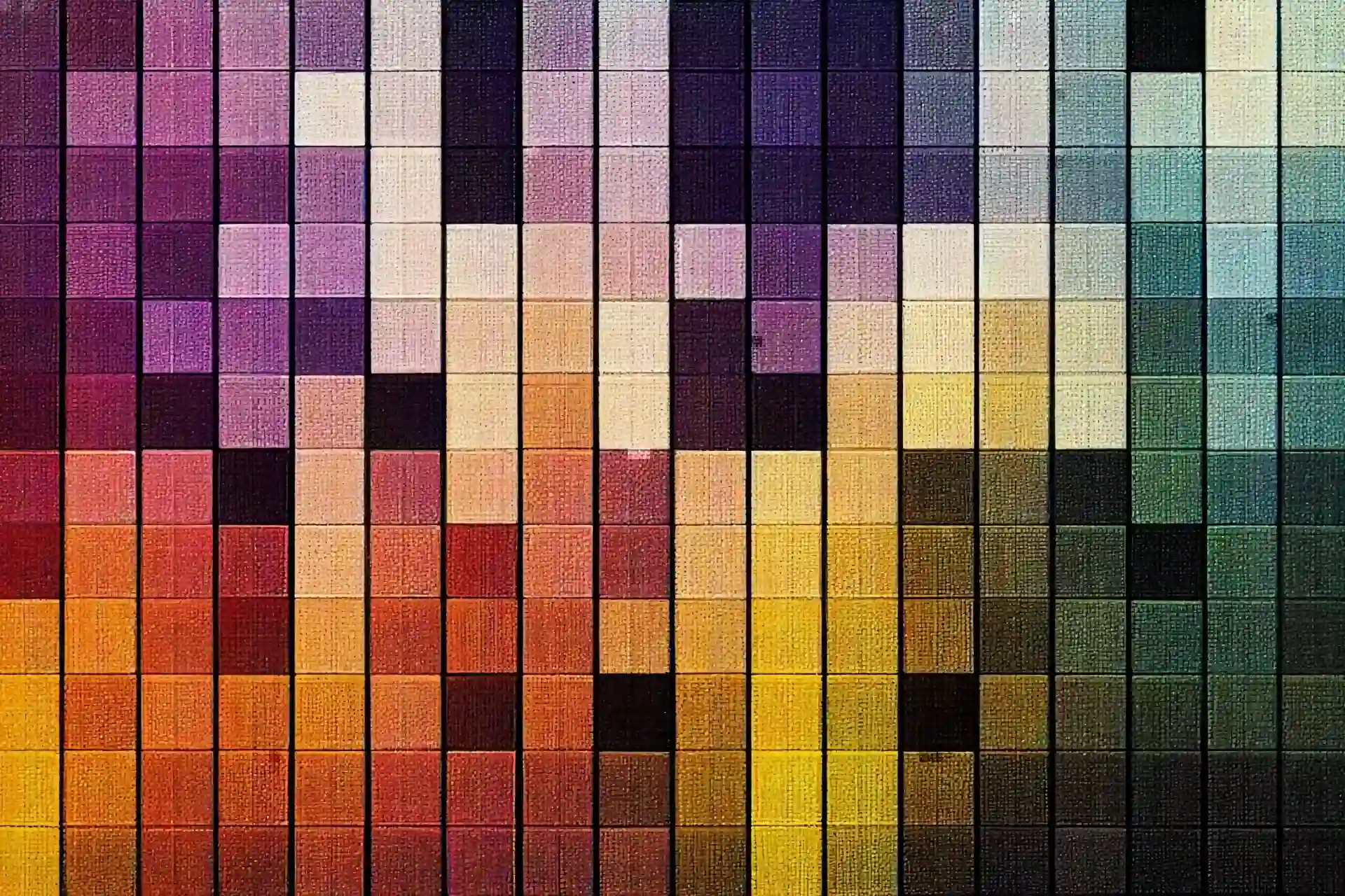
colours can evoke different emotions and feelings in people. For example, red is often associated with passion, love, and excitement, while blue is associated with calmness, trust, and professionalism. By understanding the emotions that different colours evoke, you can choose a colour scheme that aligns with your brand values and evokes the desired emotions in your audience.
Another important factor to consider is colour contrast. Choosing colours that contrast well with each other can make your design more visually appealing and easier to read. It can also help draw attention to specific elements of your design.
But, don't forget about cultural associations with colour. colours can have different meanings in different cultures, so it's important to be aware of these associations when choosing your colour scheme. For example, in Western cultures, white is often associated with purity and cleanliness, while in some Eastern cultures, it's associated with death and mourning.
So, now that you understand the importance of colour in design, let's talk about how to choose the right colour scheme.
First, consider your brand identity and values. What emotions do you want to evoke in your audience? What colours align with your brand values?
Next, think about your audience. Who are they, and what emotions and feelings are they likely to respond to?
Then, experiment with different colour combinations and contrast levels. Use tools like Adobe colour or Coolors to help you find complementary colour schemes.
Lastly, don't be afraid to get creative and try something new. Sometimes, the most effective colour schemes are the ones that break the mold and stand out from the competition.
In conclusion, colour is a powerful tool in design. It can evoke emotions, influence behavior, and create a strong brand identity. By understanding the psychology of colour and choosing the right colour scheme for your project, you can create a visually stunning and effective design that resonates with your audience. So, choose your colours wisely, and let your design stand out from the crowd!
Recent Articles
- Blender vs. Maya: Exploring - the Titans of 3D Software
- Mastering the Art of 3D Video Production: From Concept to Captivation
- Are you an artificial intelligence cub or lion?
- Enhancing Customer Service in Manufacturing: The QR Code Advantage
- Unlocking the Depth of Web Design: Embracing the Power of 3D